Year
2024
Scope of work
UI / UX
Design Audit
Interface Design
Prototyping
Domain
e-commerce
Overview
Role
UI / UX Designer
Duration
1 month
e.l.f. cosmetics is a leader in the e-commerce cosmetics domain, I was tasked with helping understand where users were facing difficulties in the shop flow and to provide solutions on how to improve the navigation and drawer menu
e.l.f. wanted to refine their search and navigation, I was tasked with finding areas that would make the greatest impact. Resources & time were limited, so it was imperative I found areas that would be easy to change and provide users with greater control when browsing through the site.
Goals
Refine Discovery & Navigation
Enhance UI / UX
Improve product discovery
Difficulties
No Dev Team
Strict adherence to existing design system
1 month to product results
Chances
Designs could impact millions of users
Impress high-level stakeholders
Create complex prototypes
My hypothesis was that e.l.f's drawer menu & navigation had confusing hierarchy, interaction, and typography.
This can potentially prevent users from finding what they need, which could lead to churn and lower conversion rates.

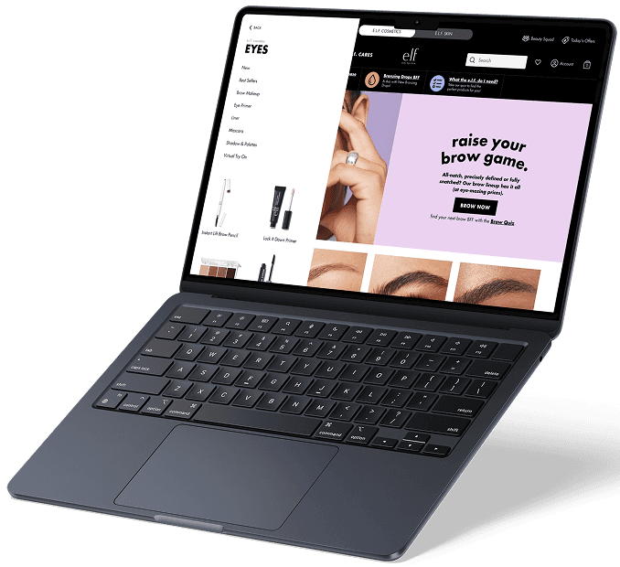
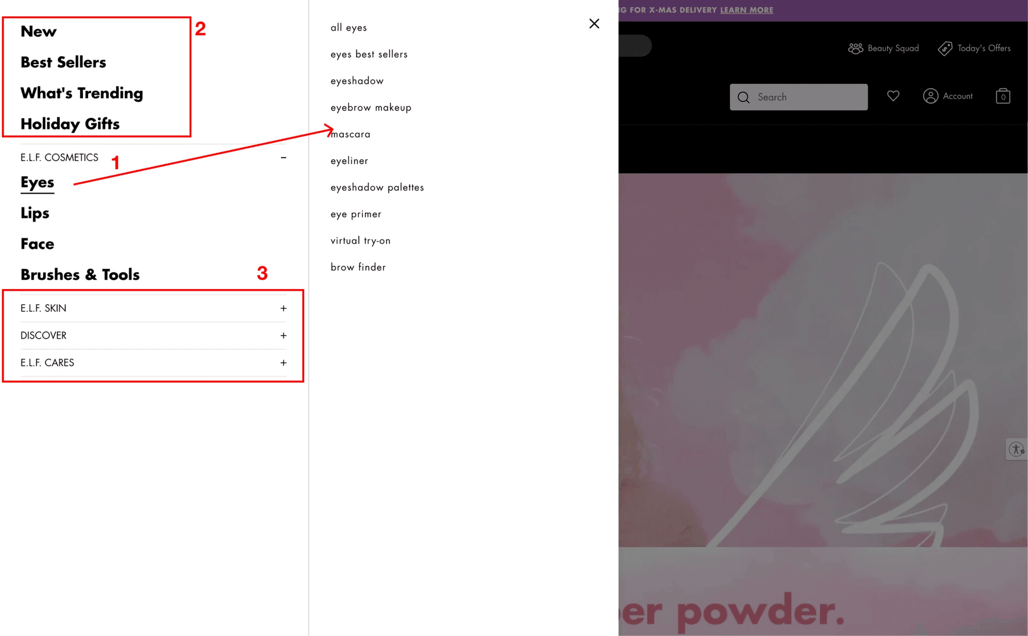
e.l.f.'s existing drawer menu
When a user has a product in mind that they want to buy, they will:
Land on website
Click on the Shop button
The drawer menu opens from left
They select a category
They select a product line / product
Then they add an item to the cart
Then they go to checkout
For this study, I focused on improving step 3, the navigation drawer, as I feel like it could have the greatest impact in the flow.
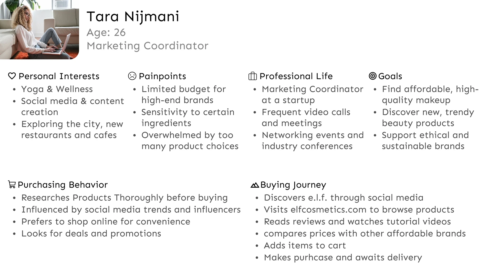
To further understand how to effectively group products, I needed to understand how users interpret Orly's product line.
I was limited in my time and resources for user research so I put together a card sort and started talking to people in stores, malls, anywhere I could find people who could be interested in cosmetics and that fit Orly's demographic:
30-55+
Female
Valued organic, healthy & cruelty-free products
Value conscious consumers
I used Miro to create a template that was worked well on my iPad and conducted user interviews. Each participants received a $25 gift certificate for their involvement and the interview took no more then 7-10min.
Once I had interviewed 10 people, I felt I had enough data to move forward.
I designed two different alternative menu layouts to address the navigation pain. One with a sequential menu, and one that had an accordion style. I also added changes to the menu organization and visual hierarchy/style to address the category concerns
This prototype explores a second menu overlay, that makes it so the user doesn’t have to move their mouse far or focus elsewhere. It also includes space for top-selling products, similar to a "Best Sellers" section.
While working through this prototype, I noticed the previous navigation becomes obscured, so I included a navigation breadcrumb to help users track their location within the site hierarchy
In this version the UI shows the sub-categories below the selected category in an accordion style. This reduces the amount of clicks it takes to navigate through the menu and allows the user to find products faster.
Updated Menu Organization & Hierarchy
My goal in improving the menu was to better organize the categories. In my prototypes, I moved "New" & "Best Sellers" and placed them within product categories, i.e "Eyes". Also, I added in a link for their "Beauty Squad" and "Virtual Studio" feature. Since e.l.f. had a space for brand categories, these seemed pertinent in that location.


Typography Changes
The main categories and sub-categories use the same font and font size, specifically Futura 16px. By employing different font weights to establish a more natural feeling hierarchy. I believe this approach is more effective, as it helps readers easily understand how the menu options are organized.
The site brought expected results for K2. It helped build a sense of trust, and image of a legitimate business to the more careful clientelle. There was a 10% spike of phone bookings which largely reduced the 3rd party service fees which was the main reason for building the site in the first place.
By putting content about Jastrzebia Góra and its attractions, K2 ranked higher in Google searches than other competitors, whos content focused just on their offer.
-55%
Time on Task
-88%
Reduction in search results
+46%
Conversion Rate


Let's work together!
© 2025 - All Rights Reserved. Amir Hussain
LET'S GET IN TOUCH